
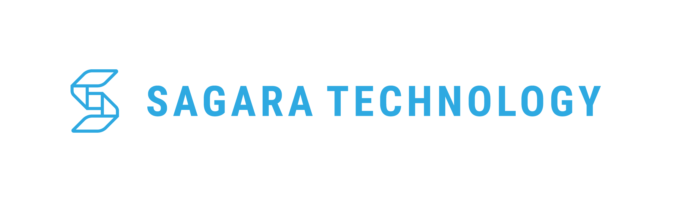
Logo
The Sagara logo takes the form of paper folds like origami art which represents the process for making objects.
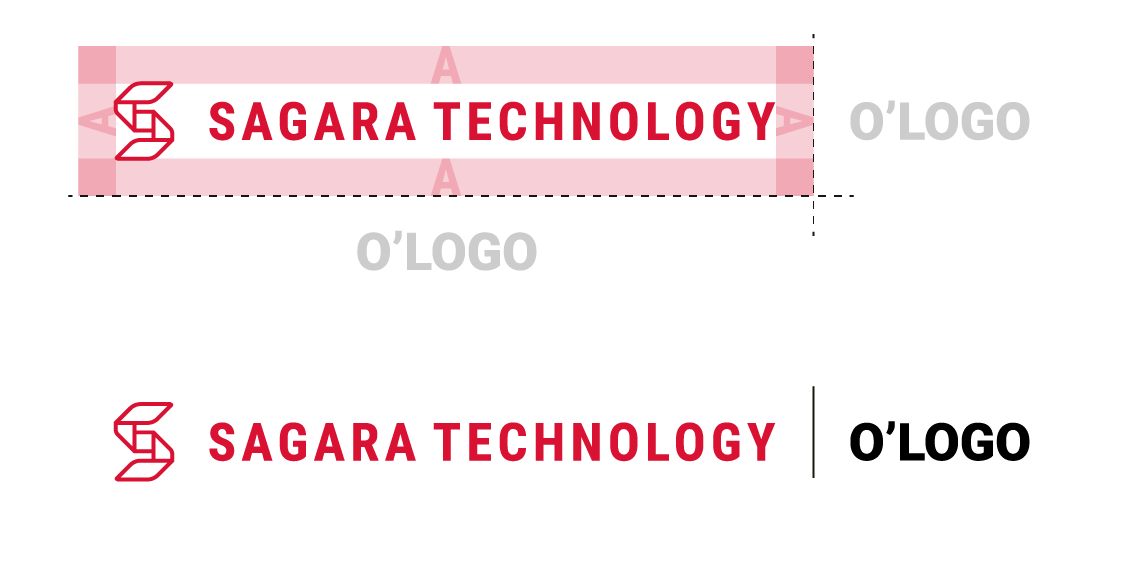
Download Sagara Logo PackOverview

The main logo, showing the shape of the fold on the logo.
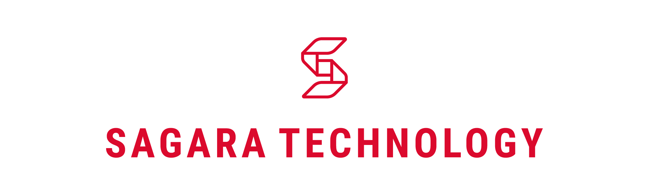
Alternative red logo in the form of lines to increase contrast on bright backgrounds.
Alternative B/W logos are made for logo flexibility in black and white format.
Construction
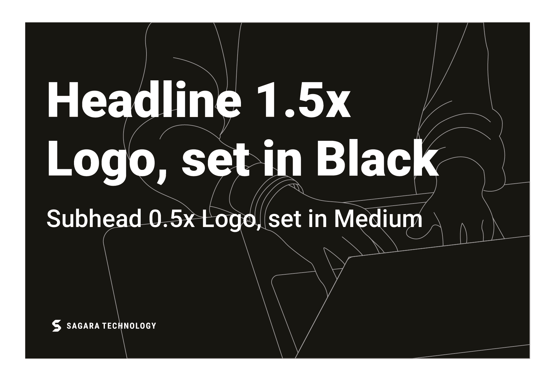
The shape in the center of the logo image, forms the basis for the size, distance and safe area for the logo.
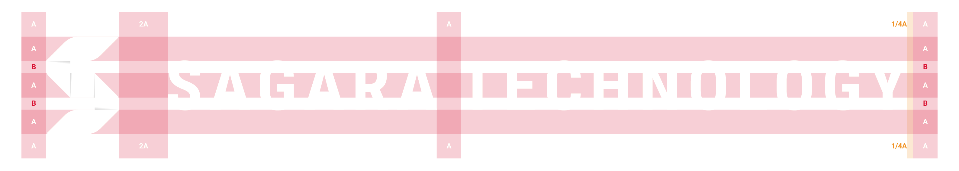
"A" is main basic size and "B" is second size or half the size of "A".
Clearspace
The clearspace around the logo is the equal to the letter A on the logo.
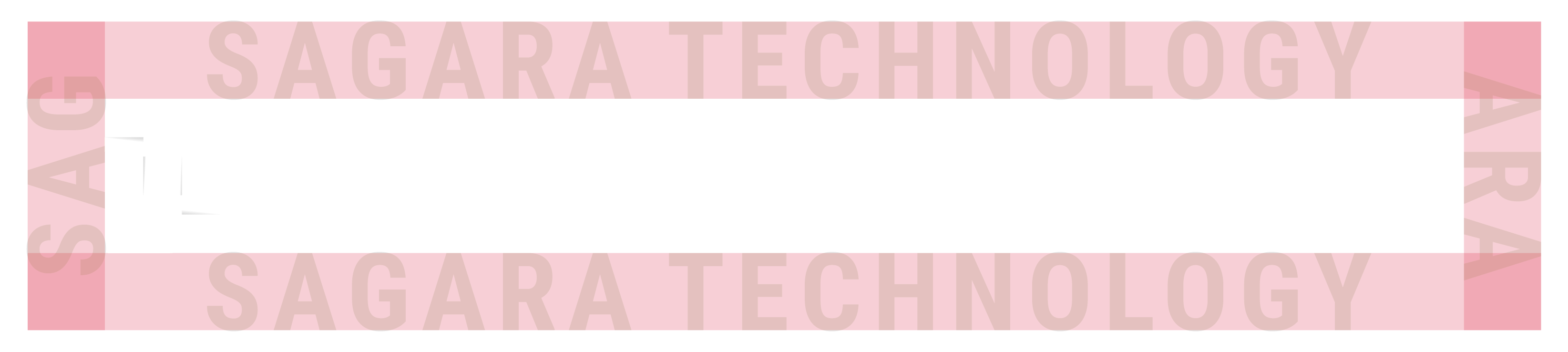
Letter A on the logo has a construction size of 2x "A".
Clearspace be the minimum limit for the Sagara logo paired with margin and other logos.
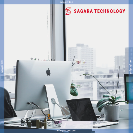
Clearspace is used on margins.
Color & Scale
The logo has 3 formats, the main logo with a black/dark background, the alternative logo is red with a white/light background and the logo can be adjusted in BW format.
Main Logo
Red Logo
BW Logo
Scale
Our logo is designed to scale to small sizes on print and screen. Smallest size: 48 px height/1,5 cm height.
To increase contrast in the smallest size, the red logo can be replaced by bw format and colored red.
To increase contrast in the smallest size, the main logo can be replaced by BW format.
Placement
The logo has several placement formats.
Left Bottom
Left Top
Center Bottom
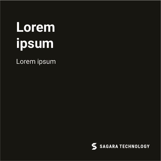
Right Bottom
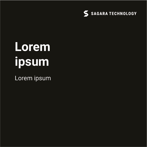
Right Top
Logo Guidance
Don’t stretch or manipulate the logo.
Don’t type Sagara Technology with another font weight.
Limit the use of the specified logo format, to maximize the contrast ratio, and help accessibility.
Don’t use logotype alone without the logo icon
Use the specified logo format and don’t change the position of the logo format.
Avoid backgrounds that reduce the contrast of the logo, and adjust the usage of the specified logo format.
Social Icons
Align the center of the logo vertically and horizontally from the shape of the icon. Use the height of the letter A as a padding to the left and right edges, three-fourths of the letter A as a padding to the top and bottom edge of the icon.
Colors
Black and white utilize our existing strengths and is positive globally. Secondary red becomes a strong contrast, making a strong focus on the Sagara brand.
Main Color
Our brand main colors are white and black. To provide accessibility, simplicity, and consistency throughout all brand communications.

Black
White
Secondary Logo

Red

Light Red

Grey

Light Grey
Gradient Color
Gradation hitam to transparent is used to support the placement of logos on a crowded background and reduce logo contrast.
 Color Guidance
To maintain the clarity of the logo, here are examples of using the recommended format.
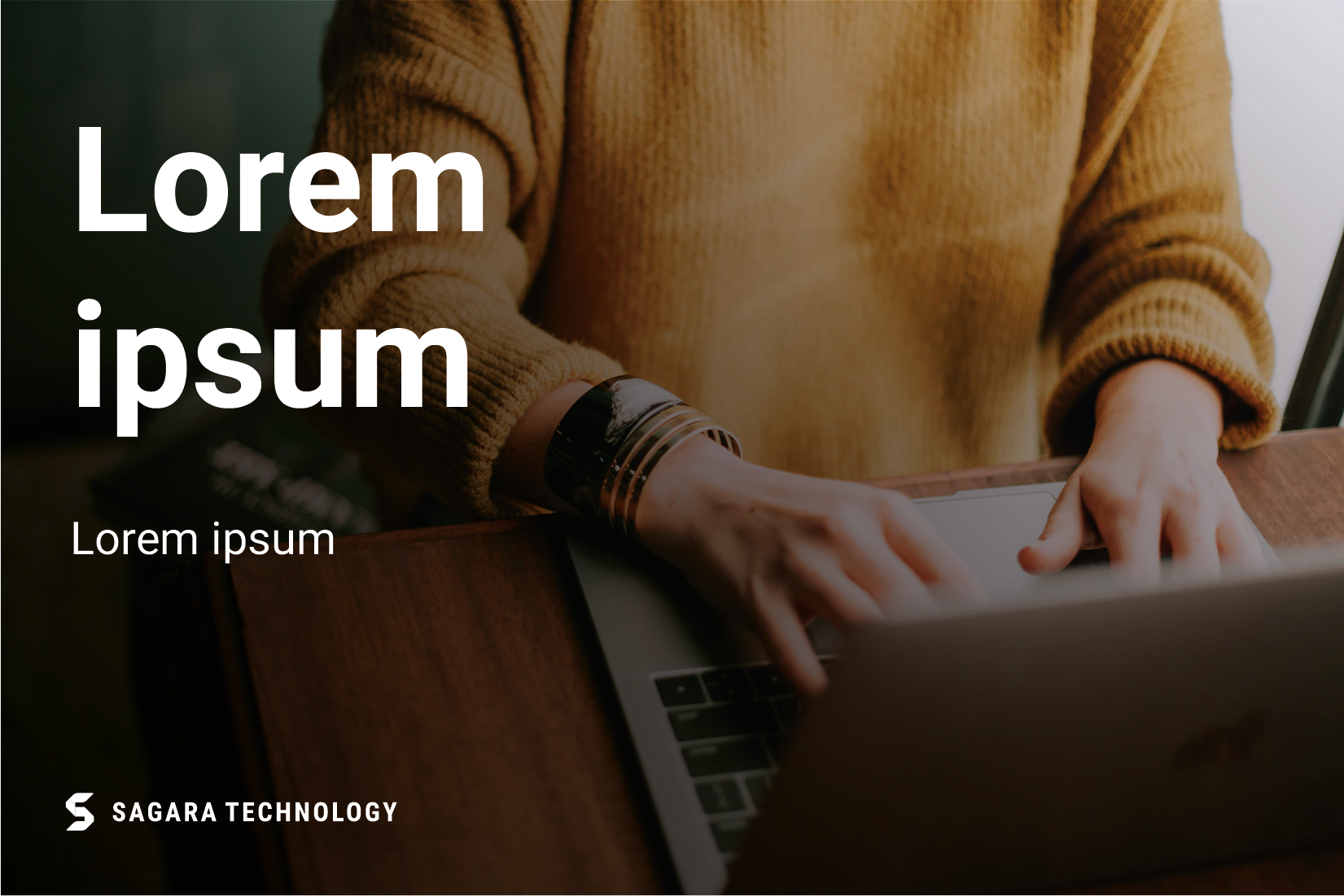
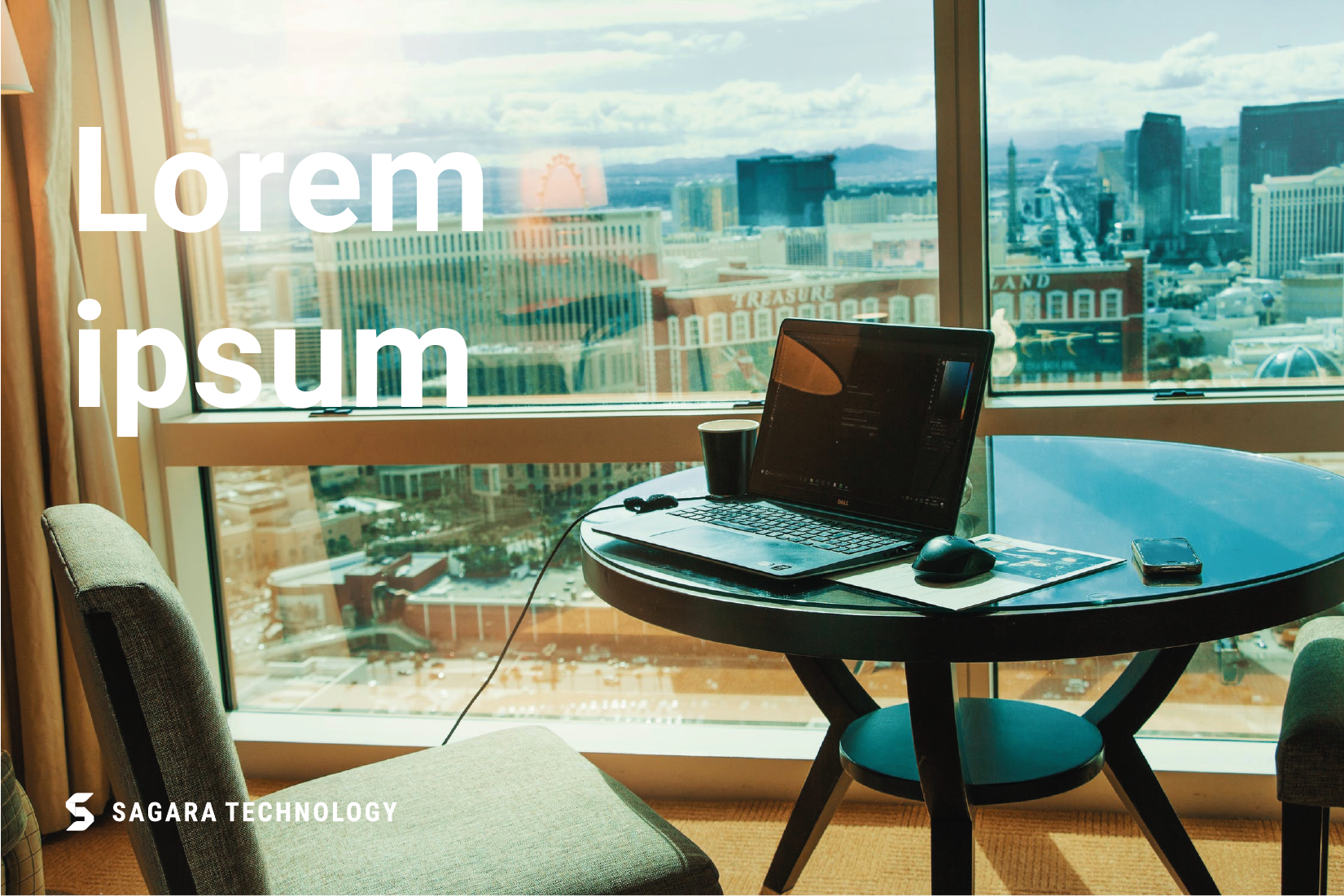
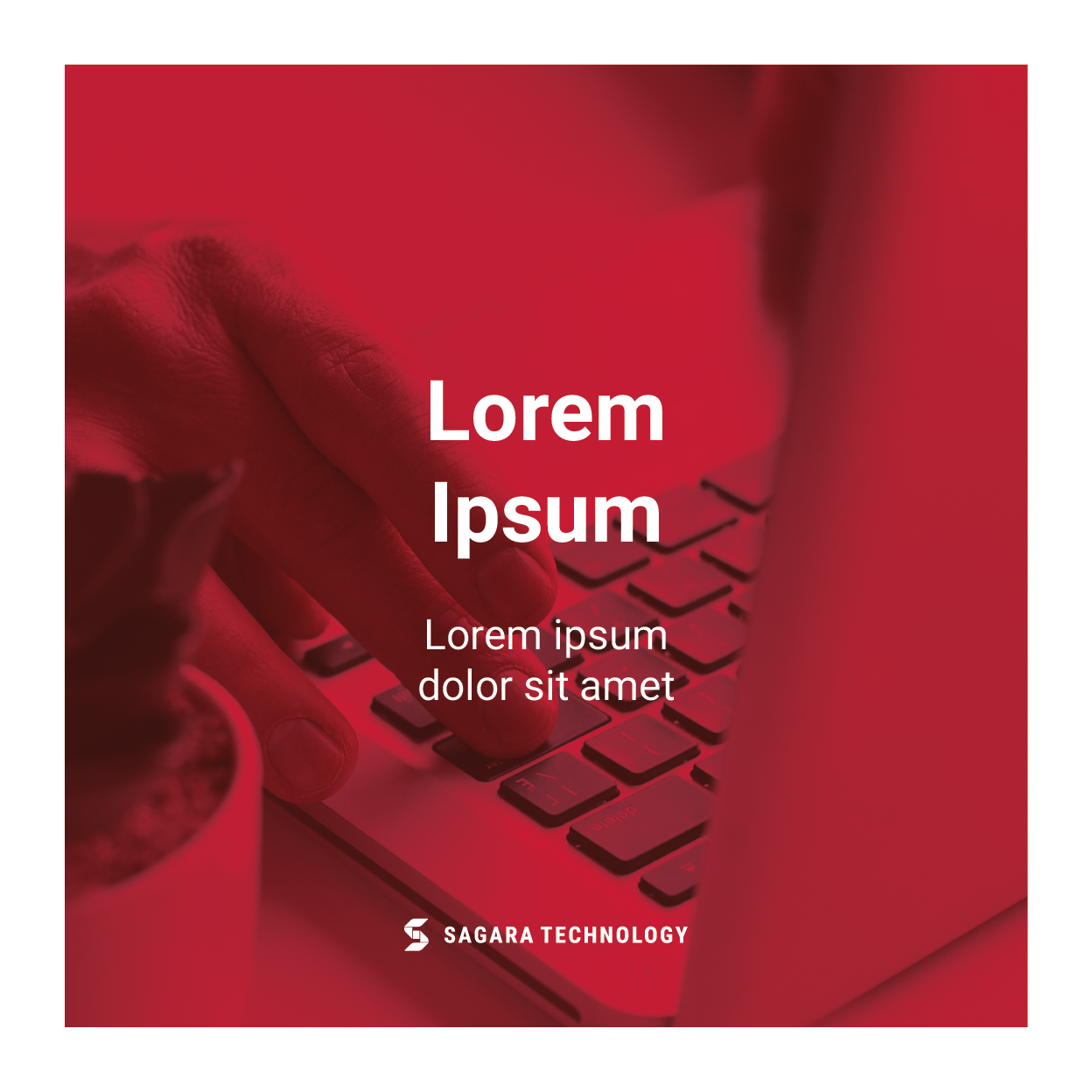
The main logo and gradient are used to increase the contrast of the logo with the background.
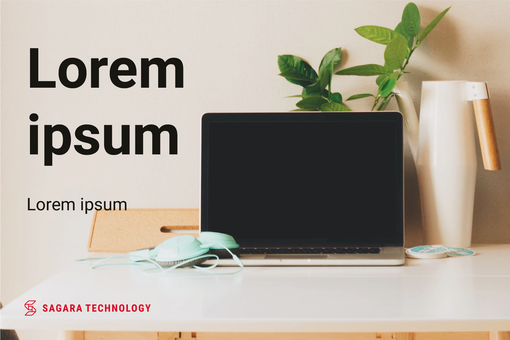
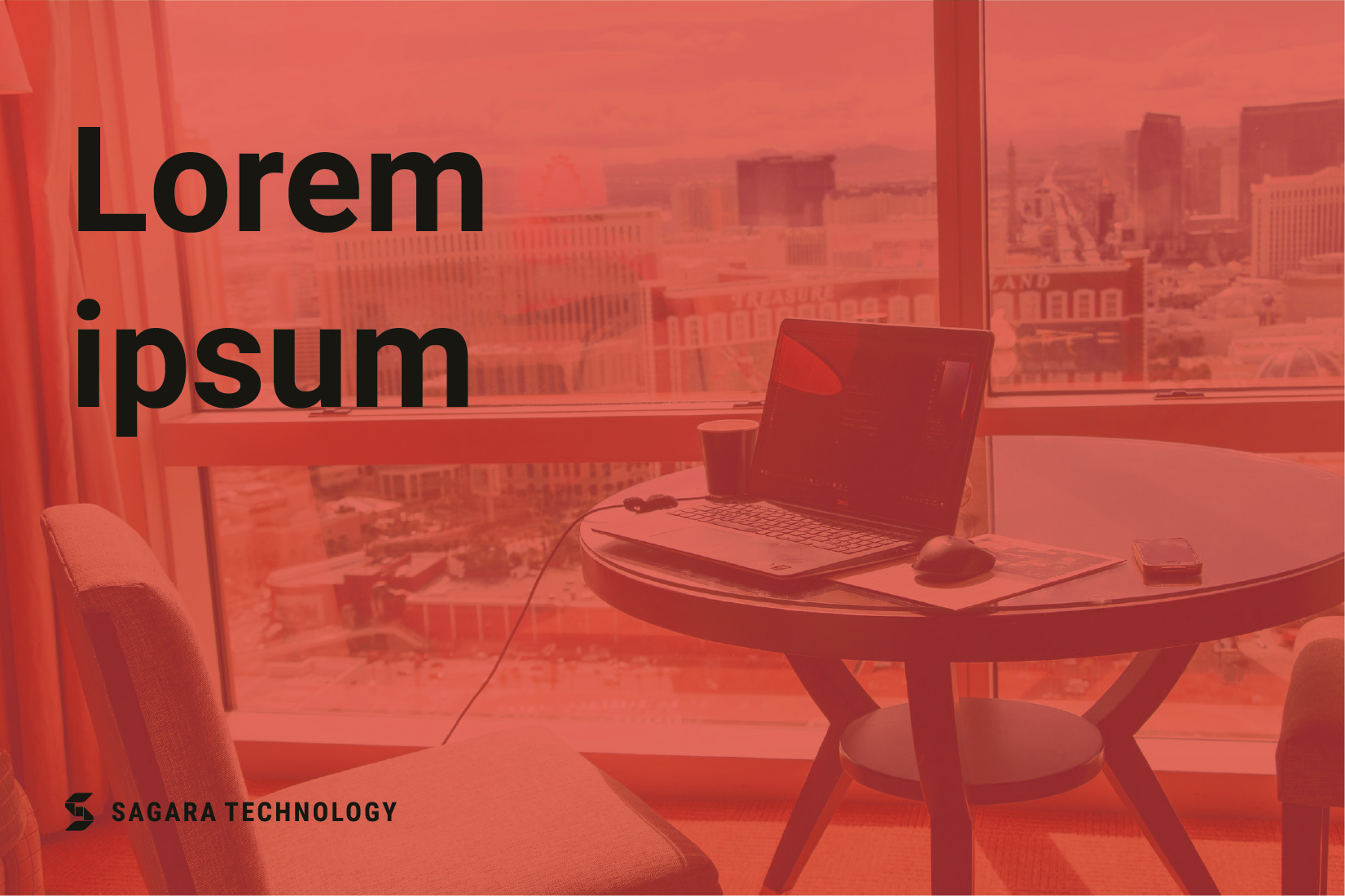
The main logo can be used with black / dark background conditions.
Background using the appropriate color can be paired with the main logo.
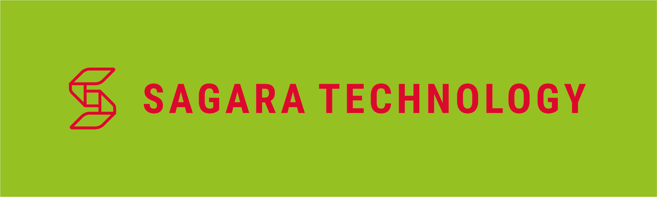
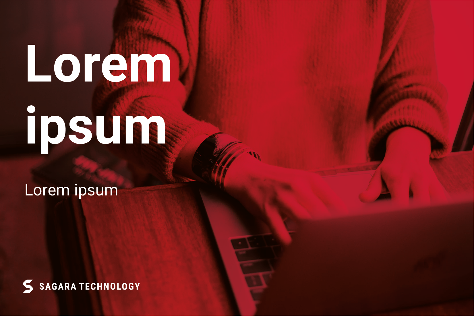
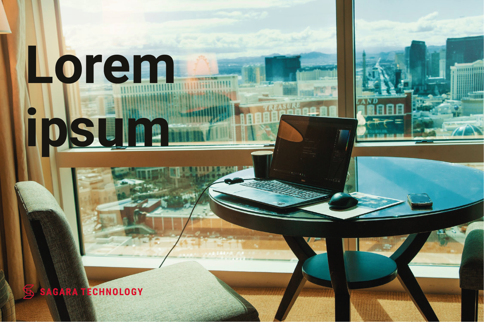
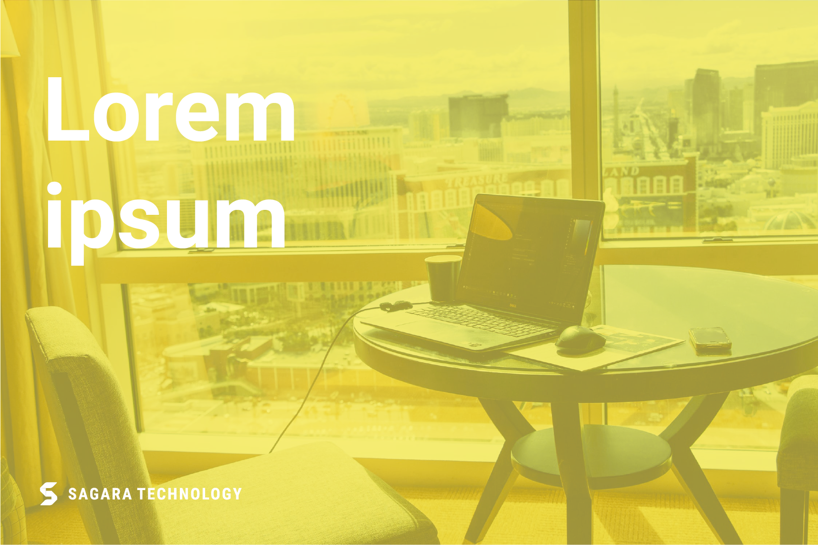
Bright backgrounds can use the red logo to increase contrast.
The use of the red logo can be paired to a white background.
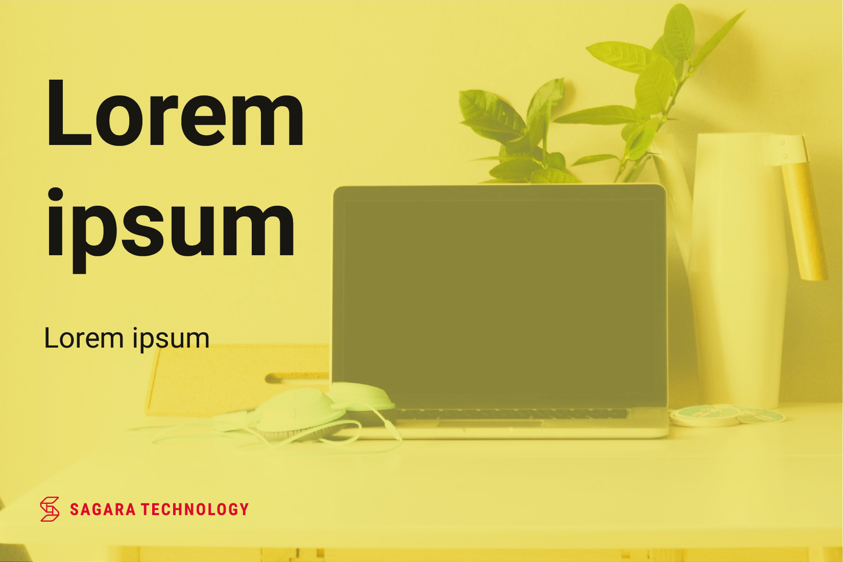
The use of the red logo can also be paired on a brightly colored background.

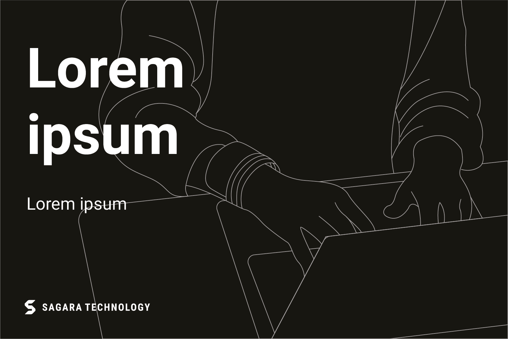
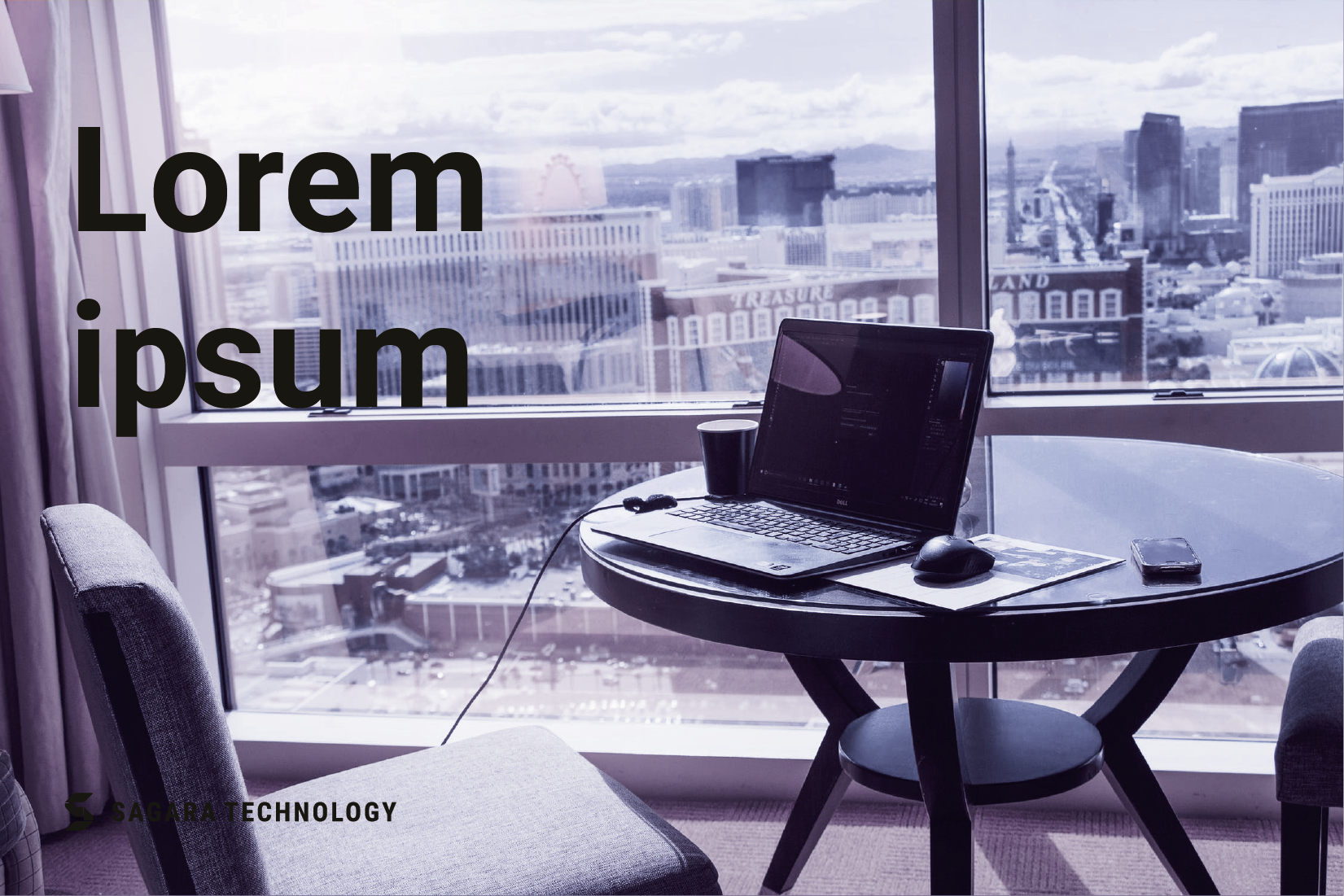
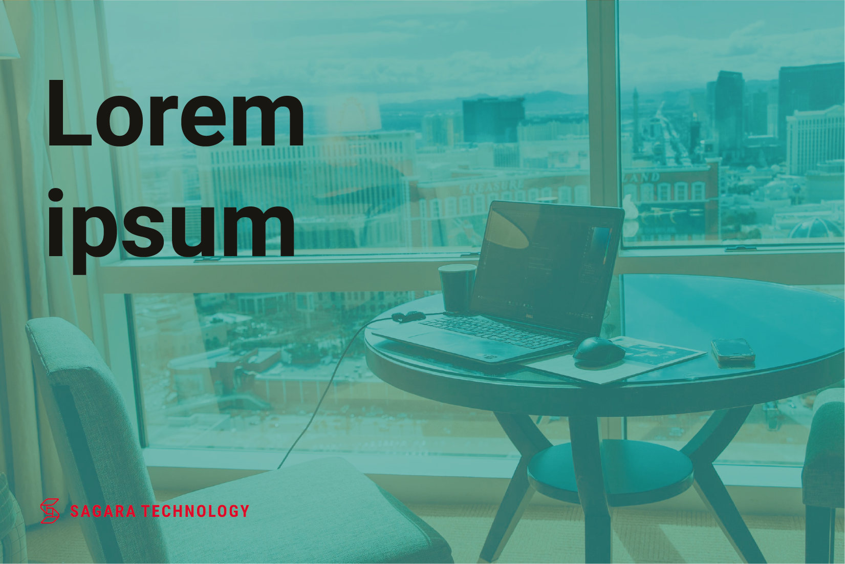
Background in grayscale format use the customized BW logo format.
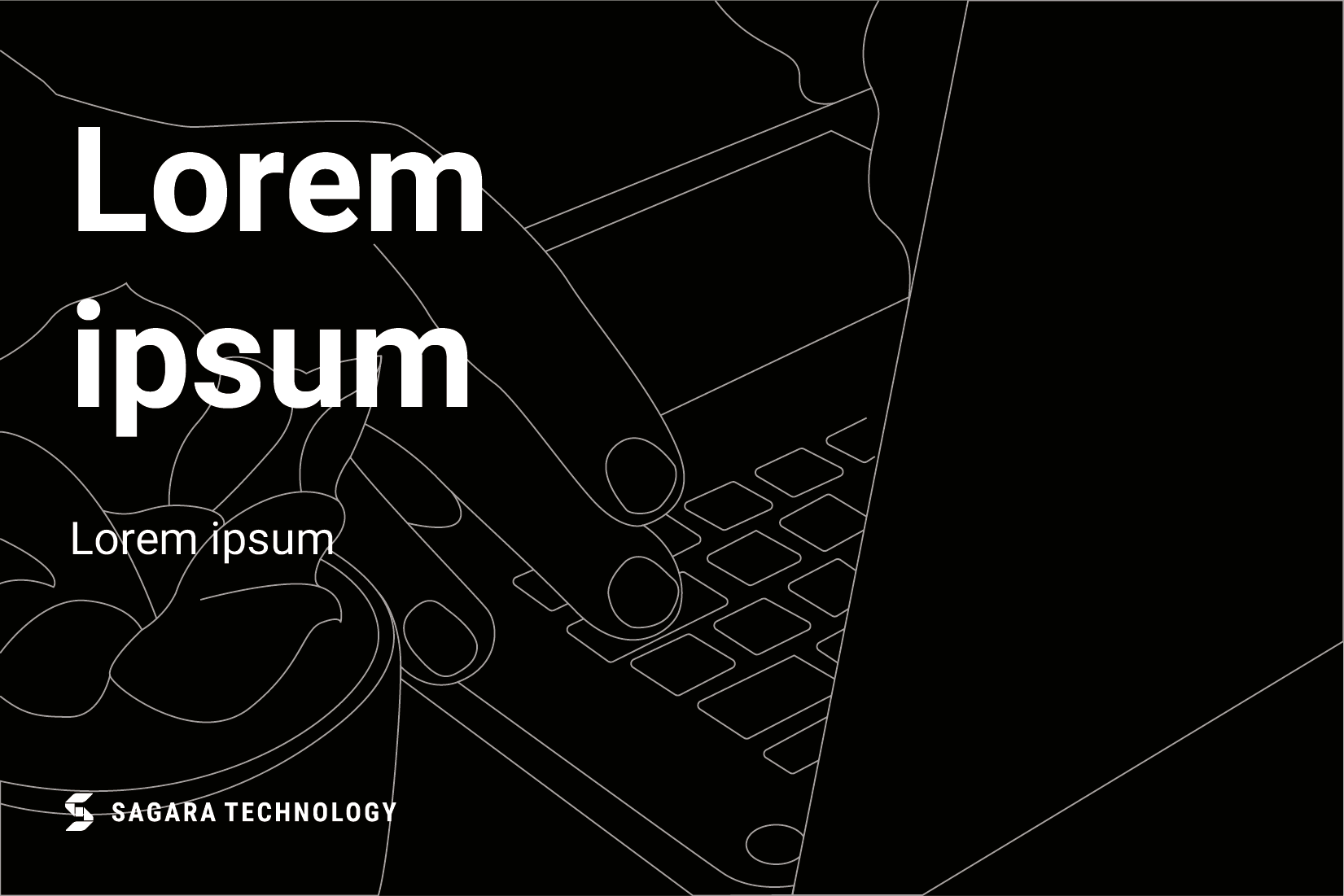
BW logo format with white color paired with a black background.
BW logo format with black color paired with a white background.
Avoid
Pay attention to the composition of the photo / background for the correct placement of the logo.
A crowded background cannot be paired with the main logo.
A crowded background cannot be paired with red logo.
A crowded grayscale background cannot be paired with the BW logo.
Background using bright colors cannot be paired with the main logo.
Note the color tone that will be used for the background to use the red logo.
Background with color cannot be paired with the BW logo format.
Composition
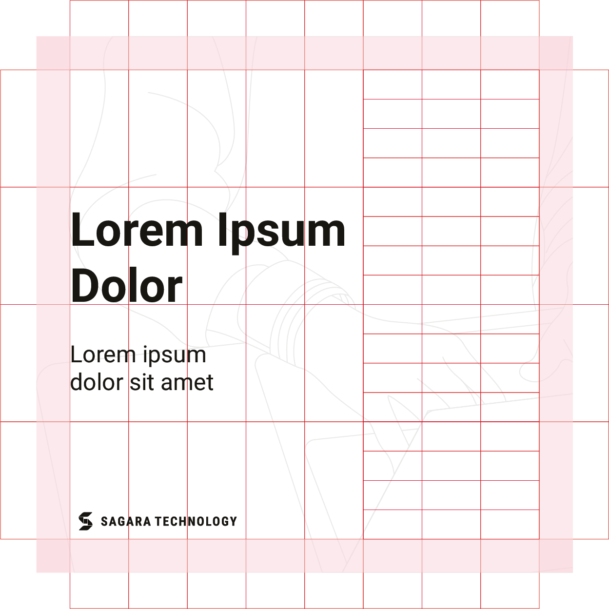
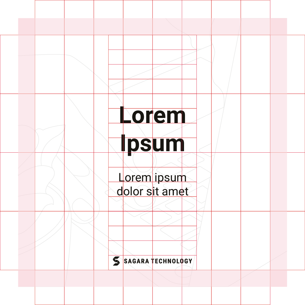
Our composition system is elegant in its simplicity of use, emphasizing focus and legibility. Build a Grid that is easily adjusted across different sized compositions.
Layout & Grid
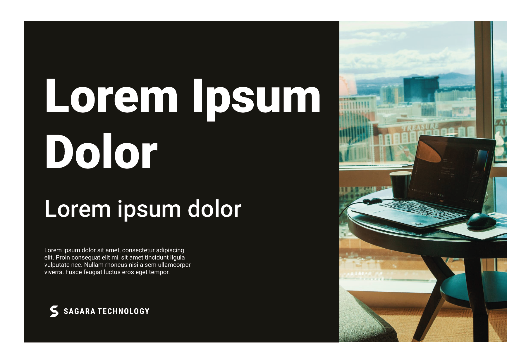

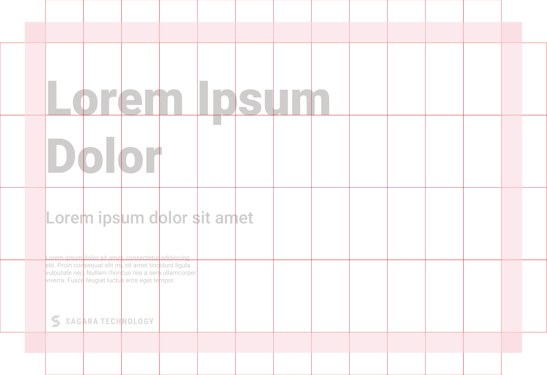

Example of layout composition and use of a 12 column grid.
Square Layout
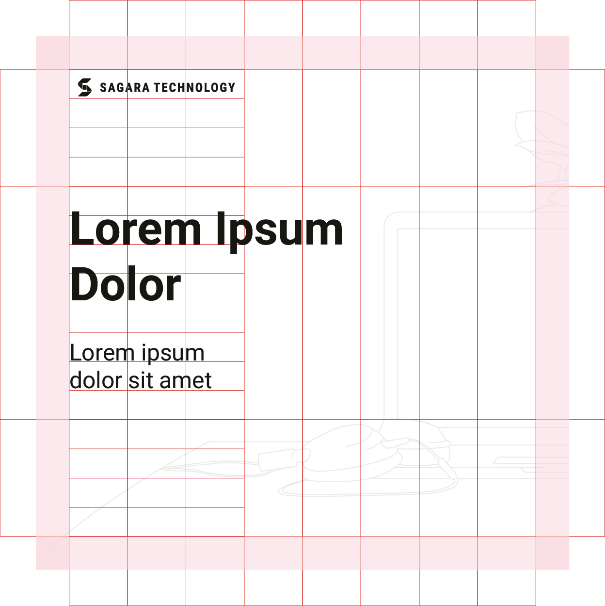
Example of layout composition and use of a 8 column grid.
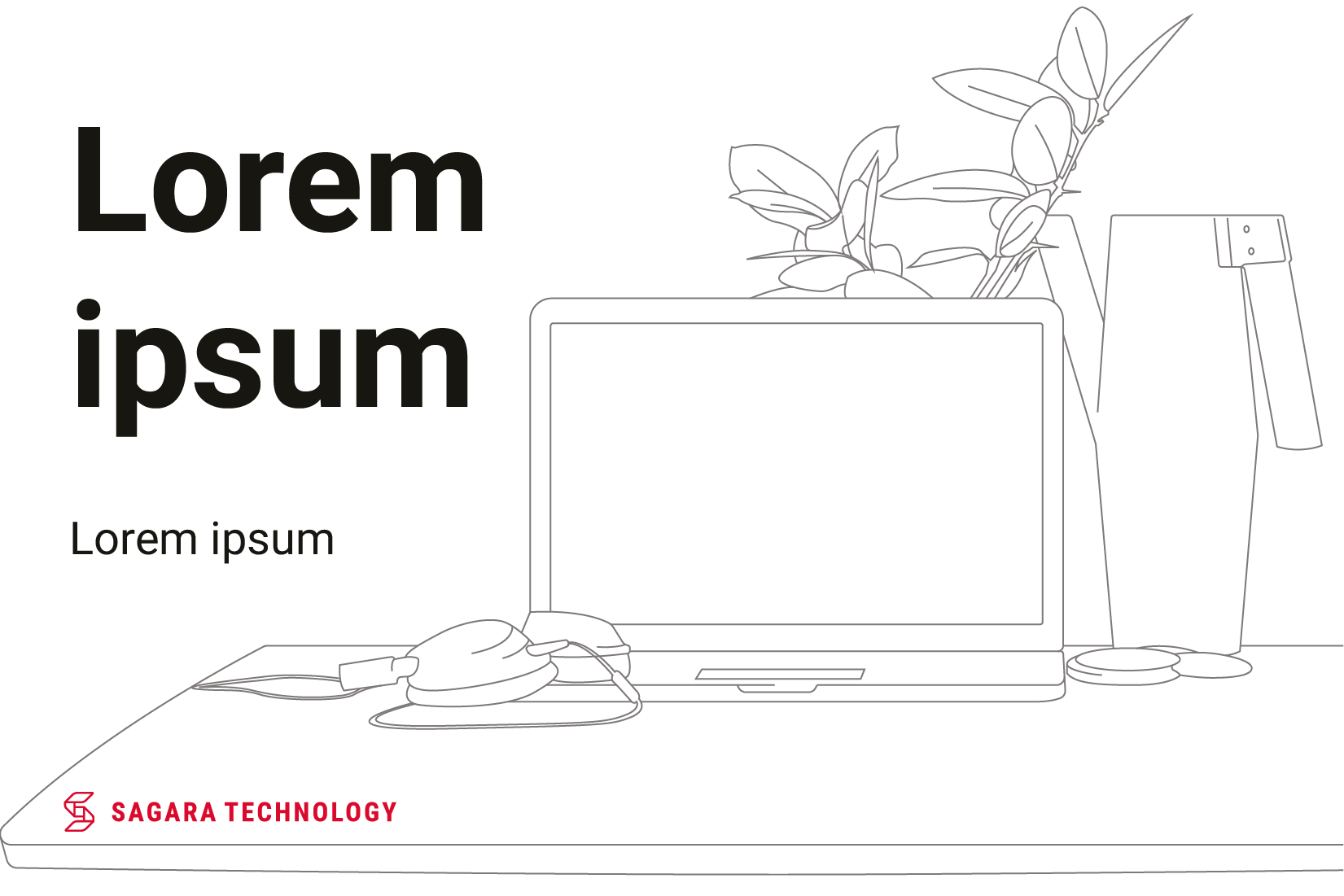
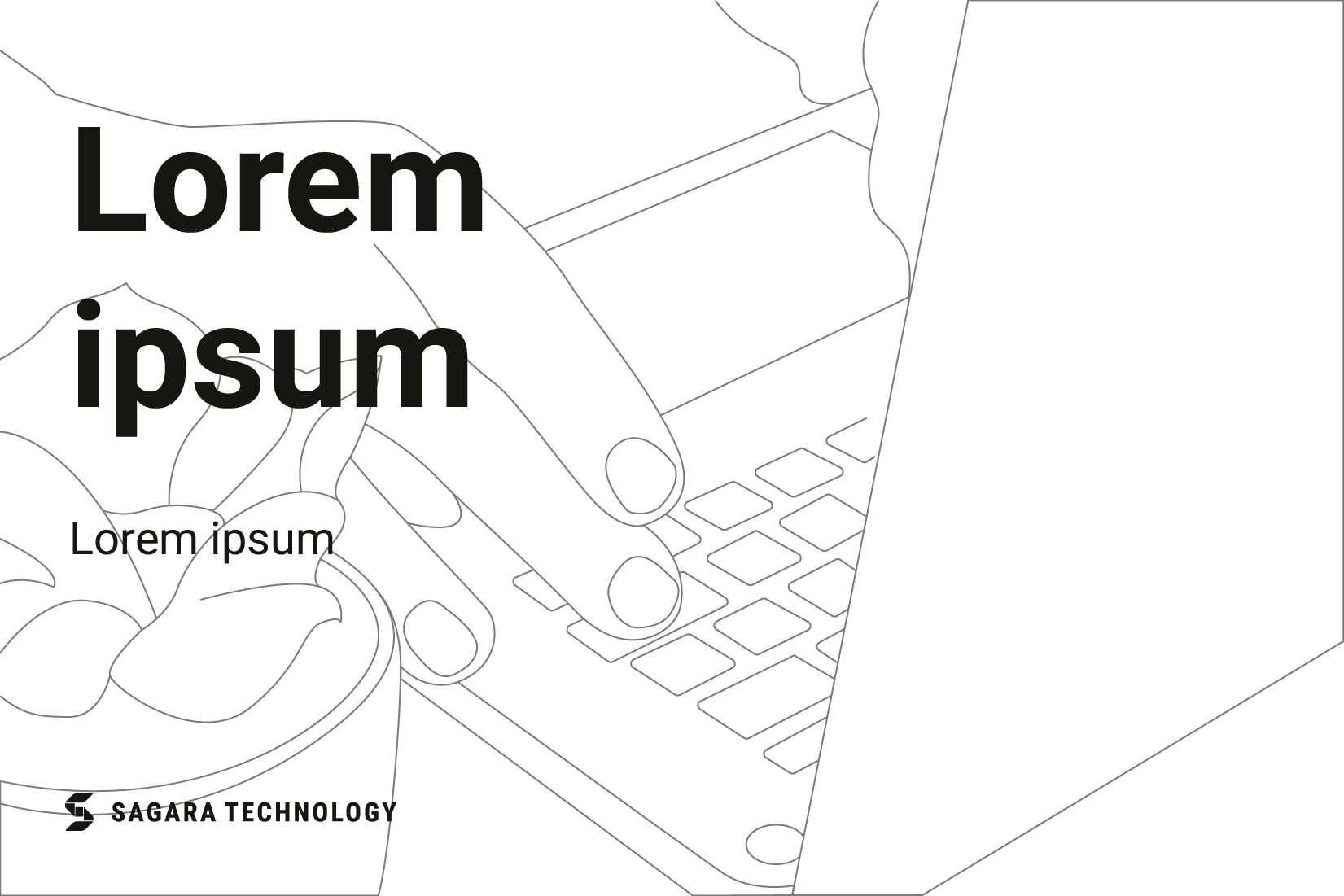
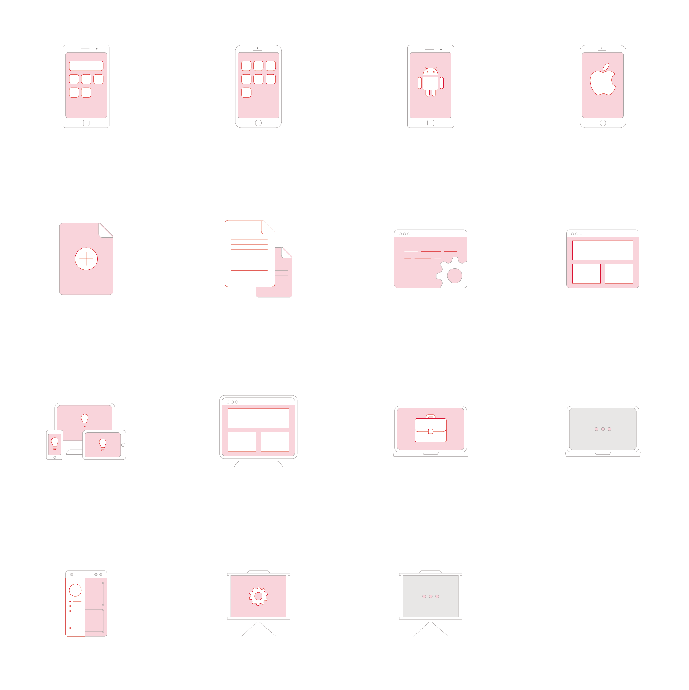
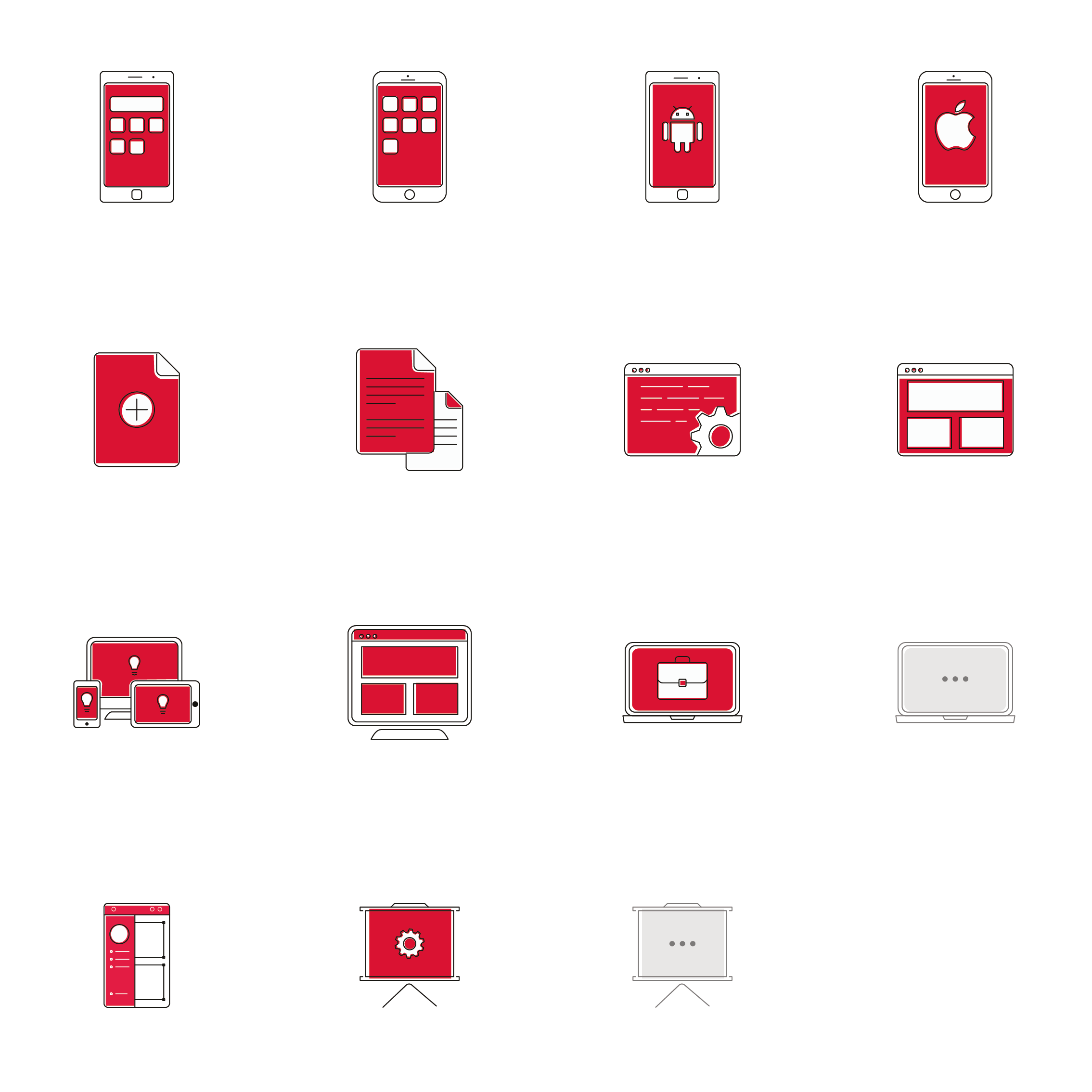
Illustration
Illustrations used by objects around technology and computing. Simple shapes, clean lines, limited colors, and corresponding realities, give an impression of our brand and make it easy to digest and understand.
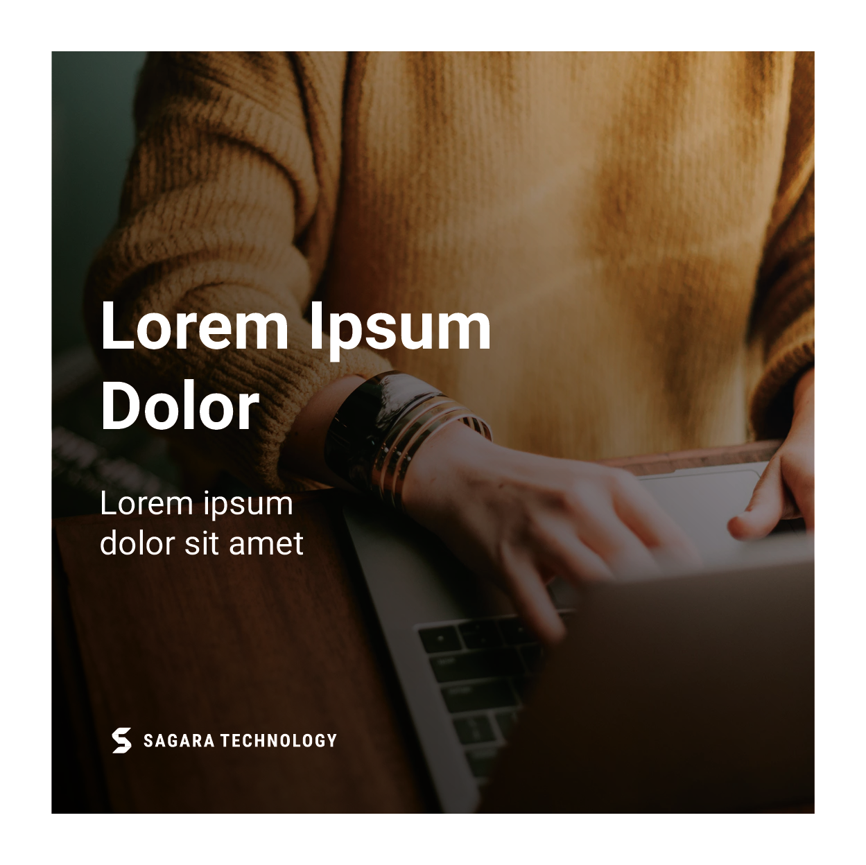
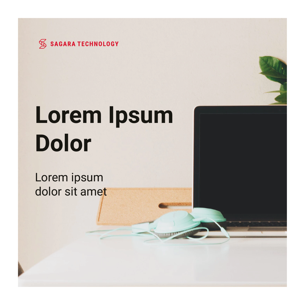
Photography
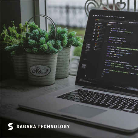
Our photography illustrates the fields we do, what we do and how we work. With a clean, simple, and focused composition. Showing what we do and our work processes.


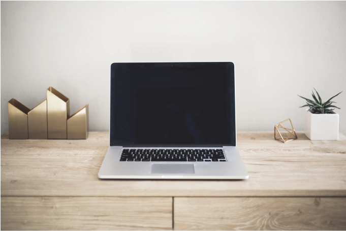
Photography shows how we work
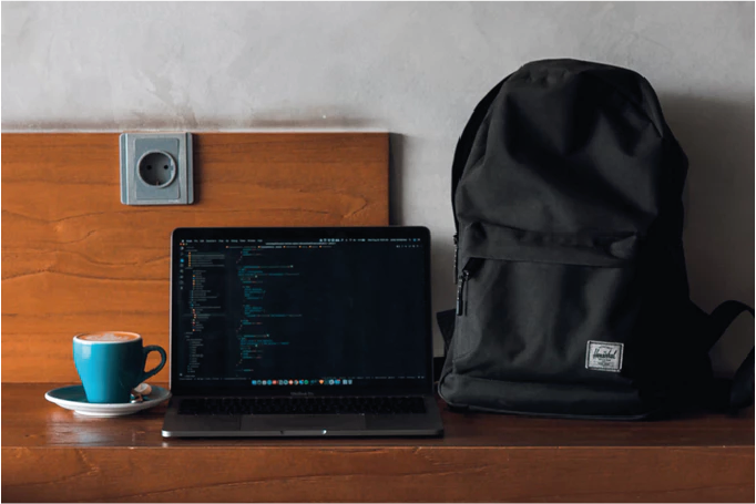

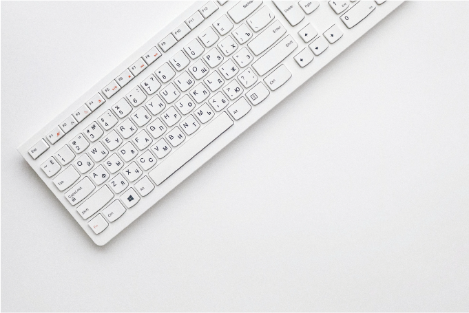
Photography shows the field and with what we work.


Photography shows the team in working together, and how the process we are working on.
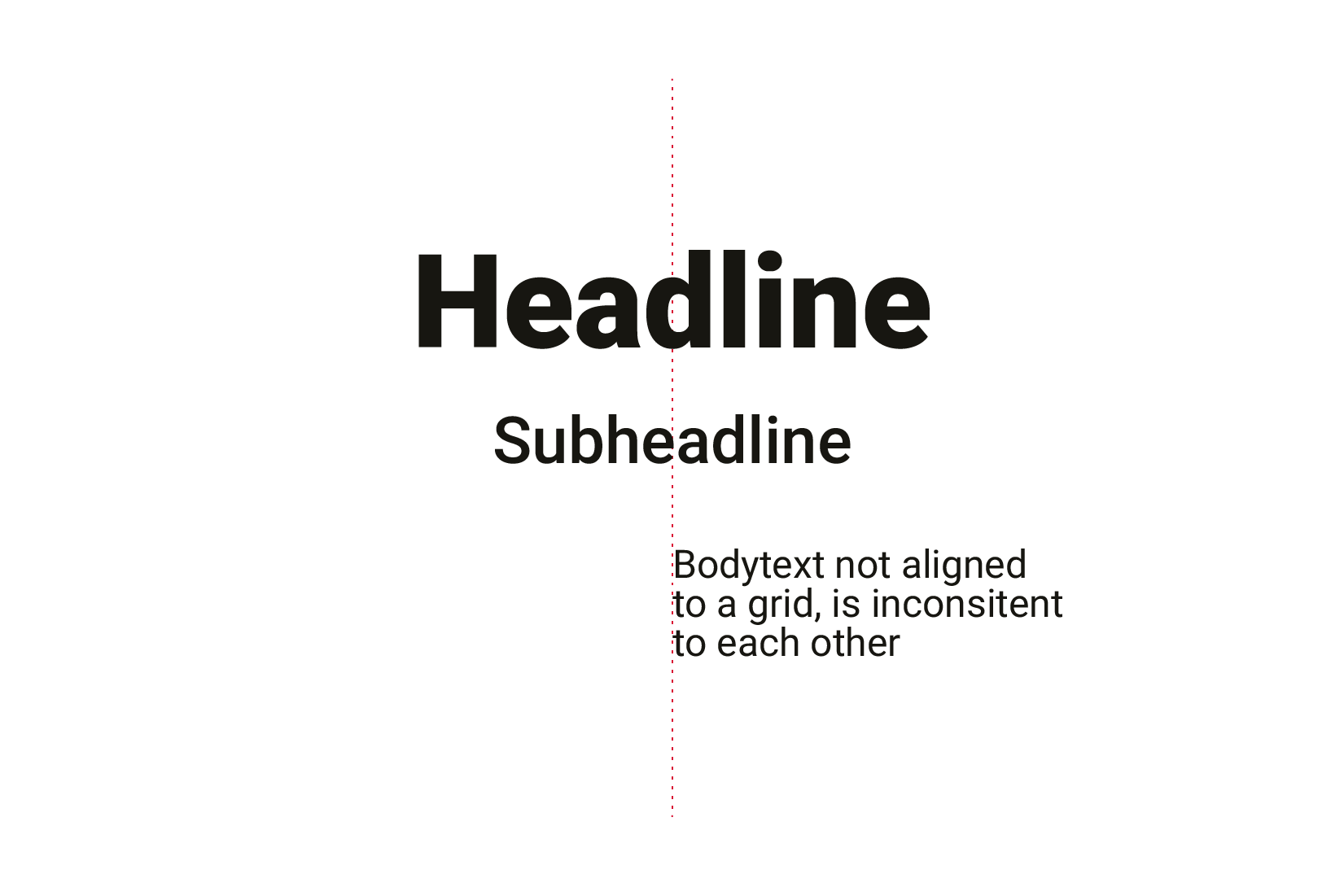
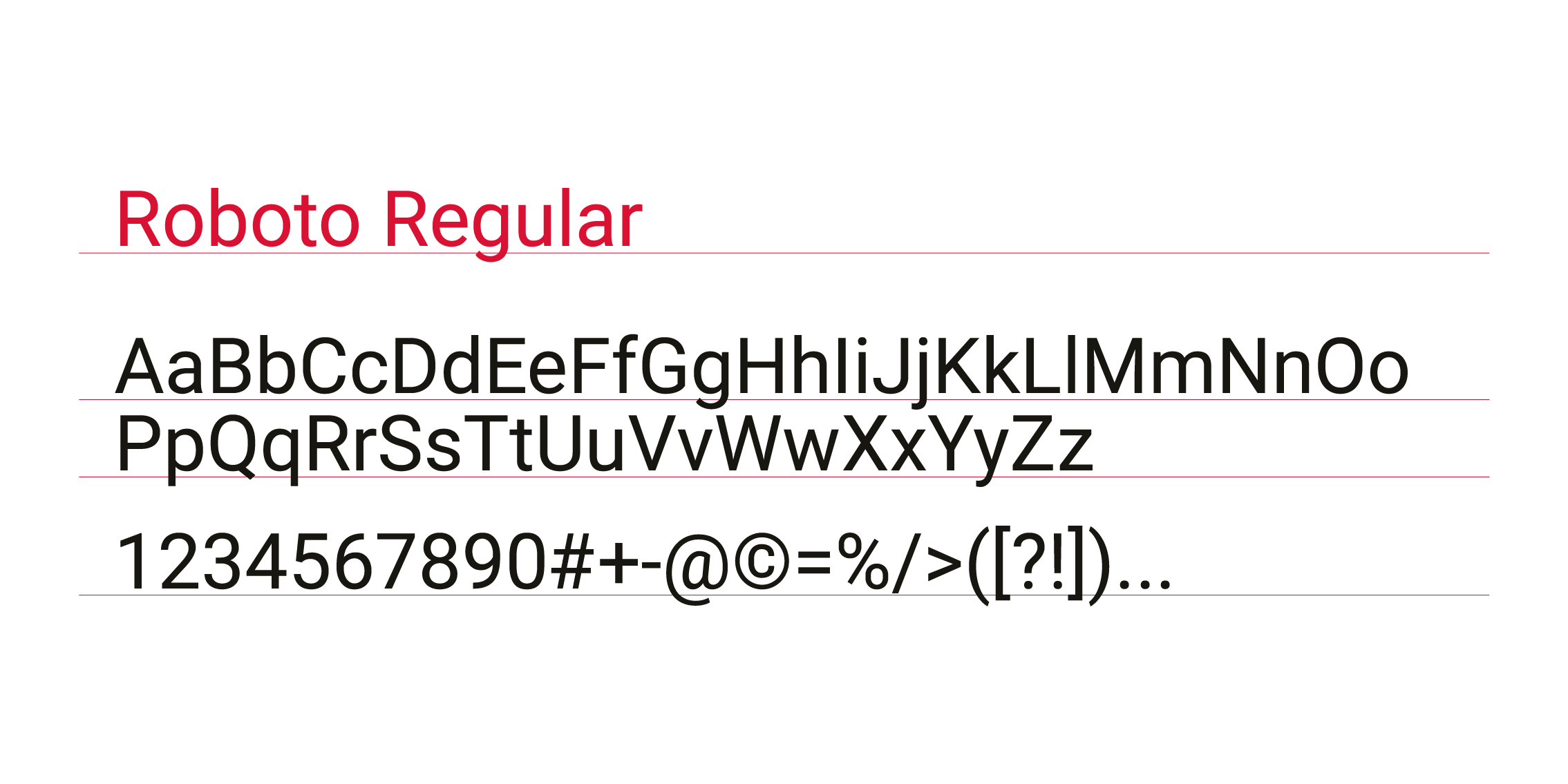
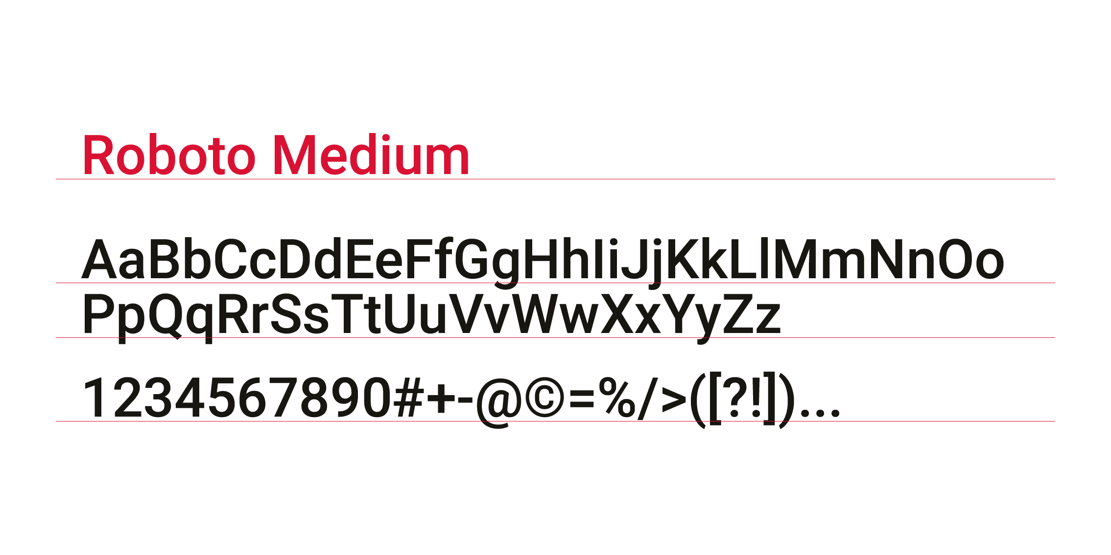
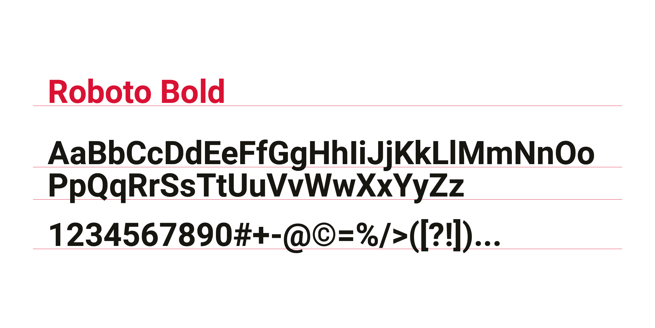
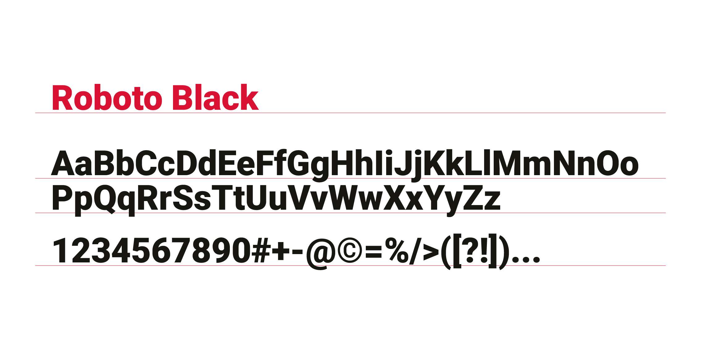
Typography
Our typography is easy to use and has been used globally and there are various font-weights that can be used. We use the Roboto font.
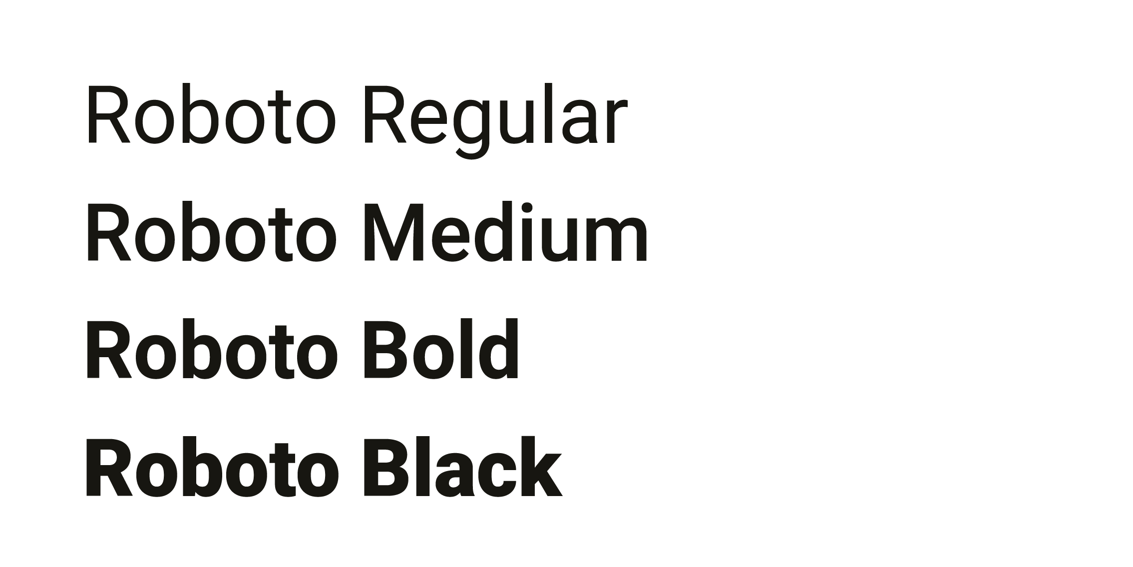
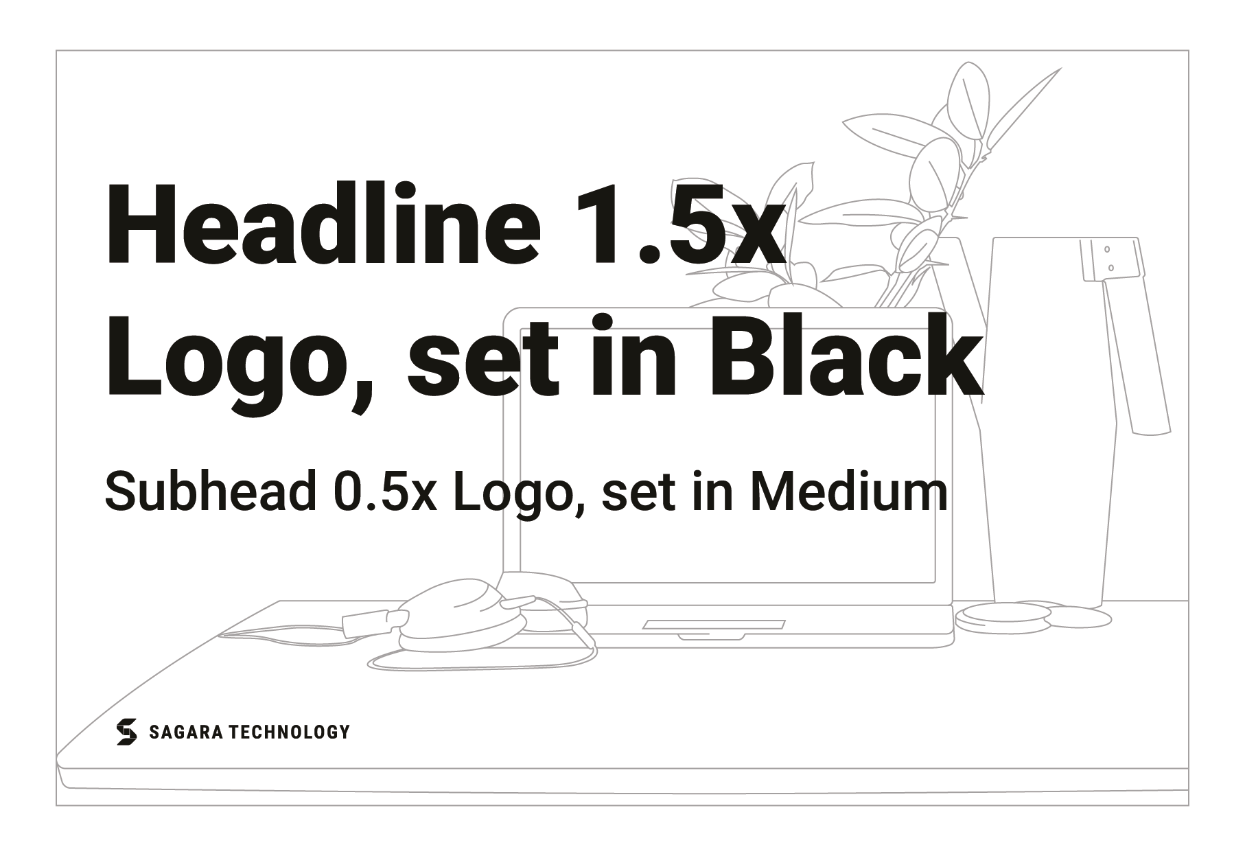
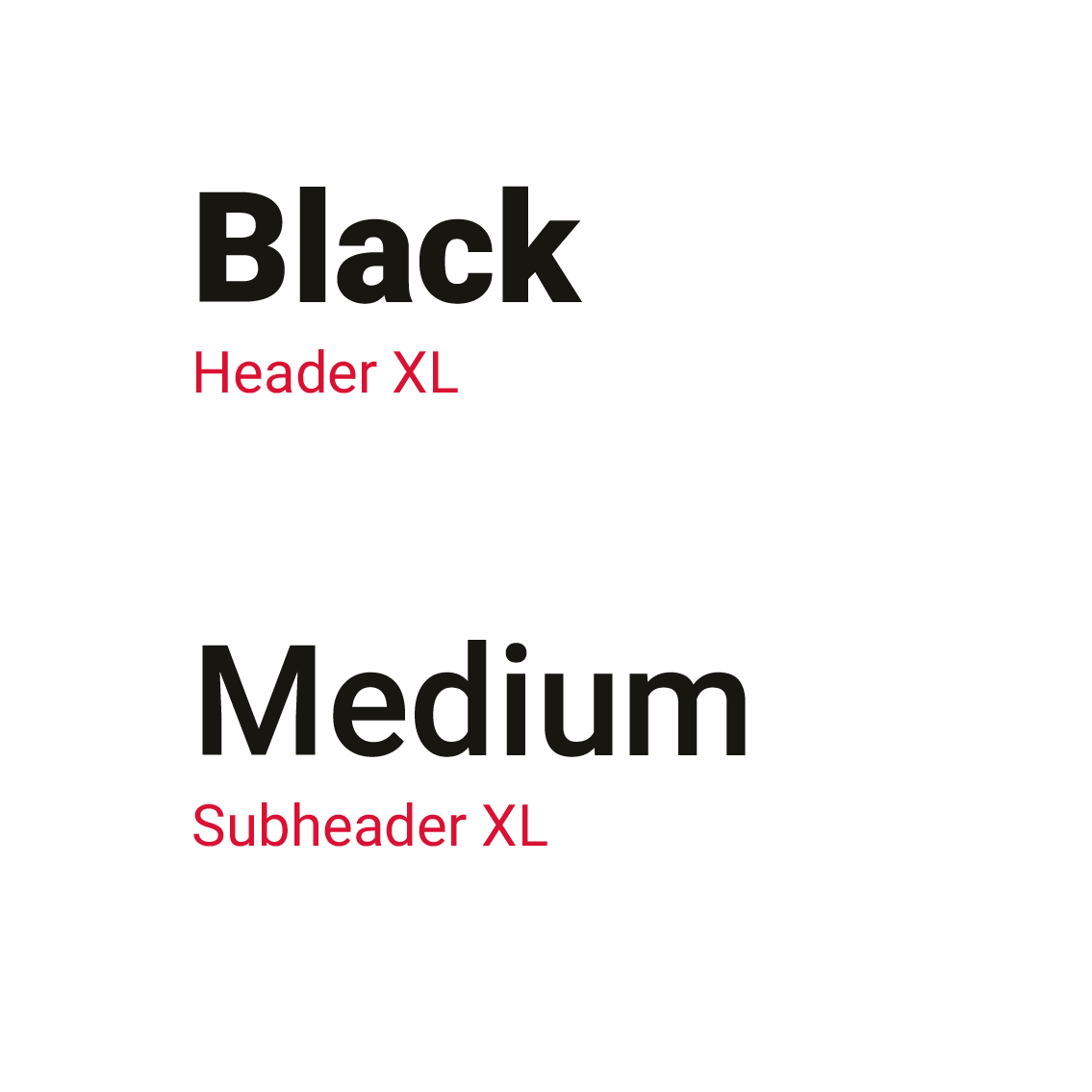
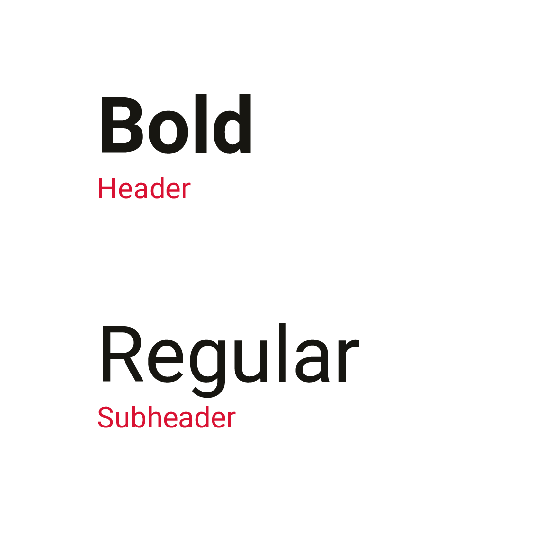
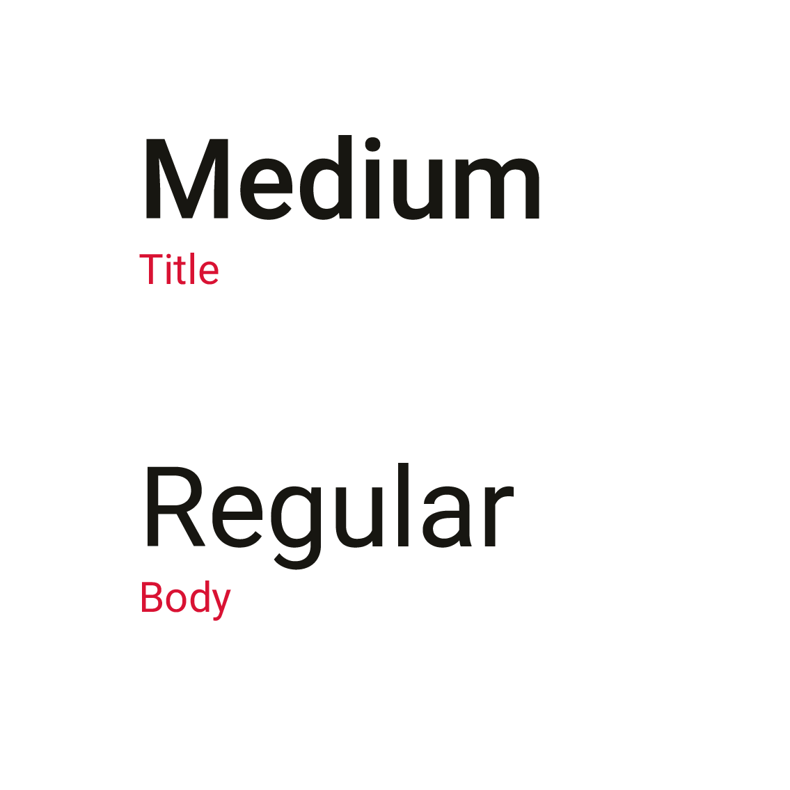
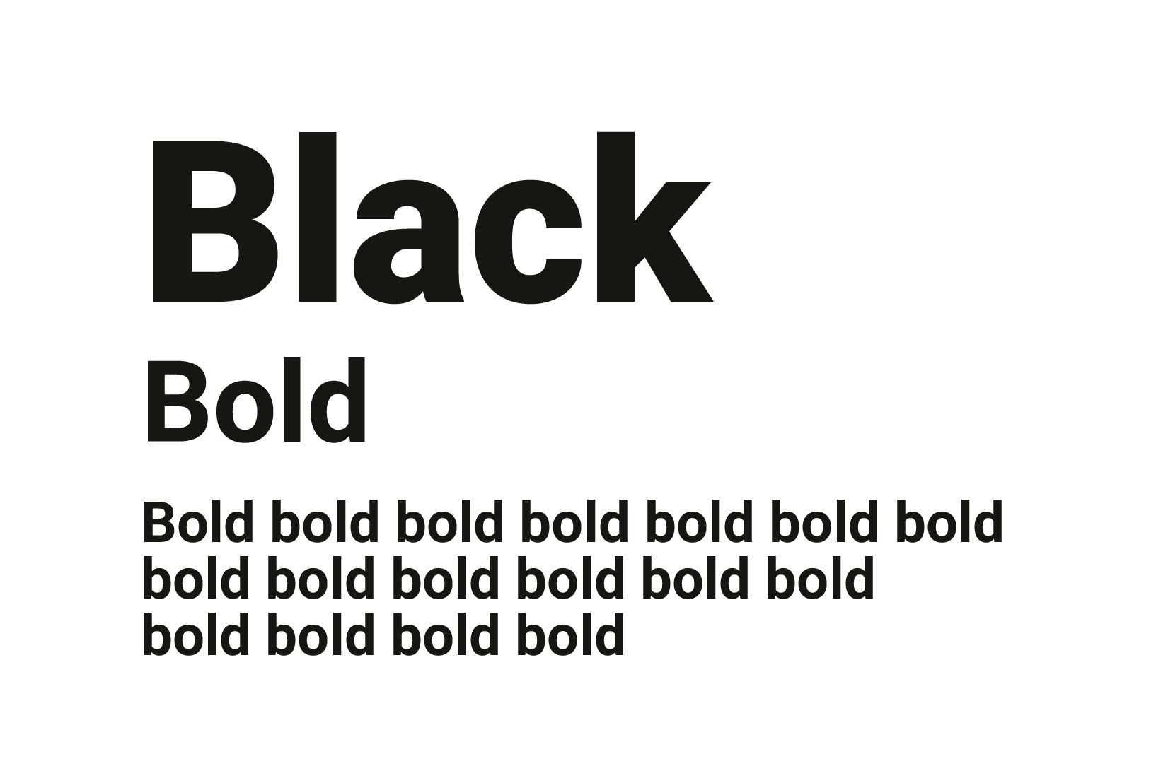
Font Weights
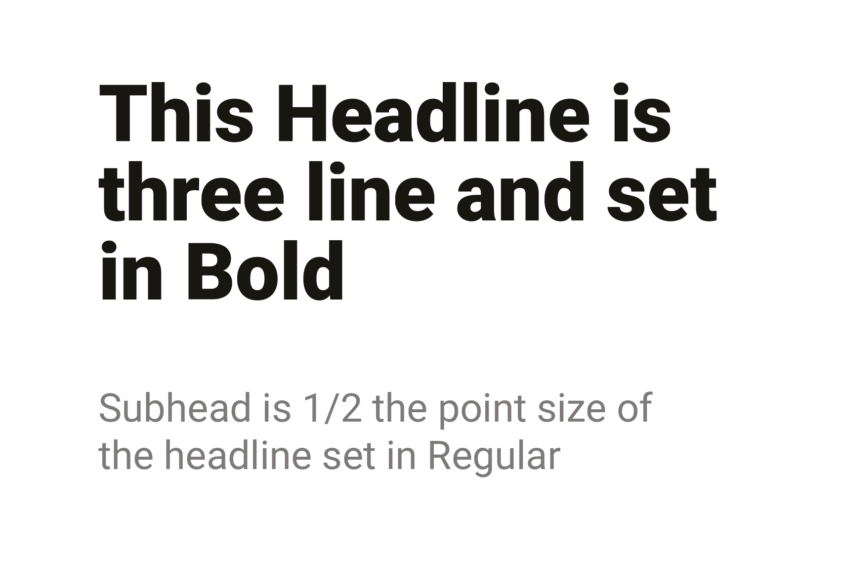
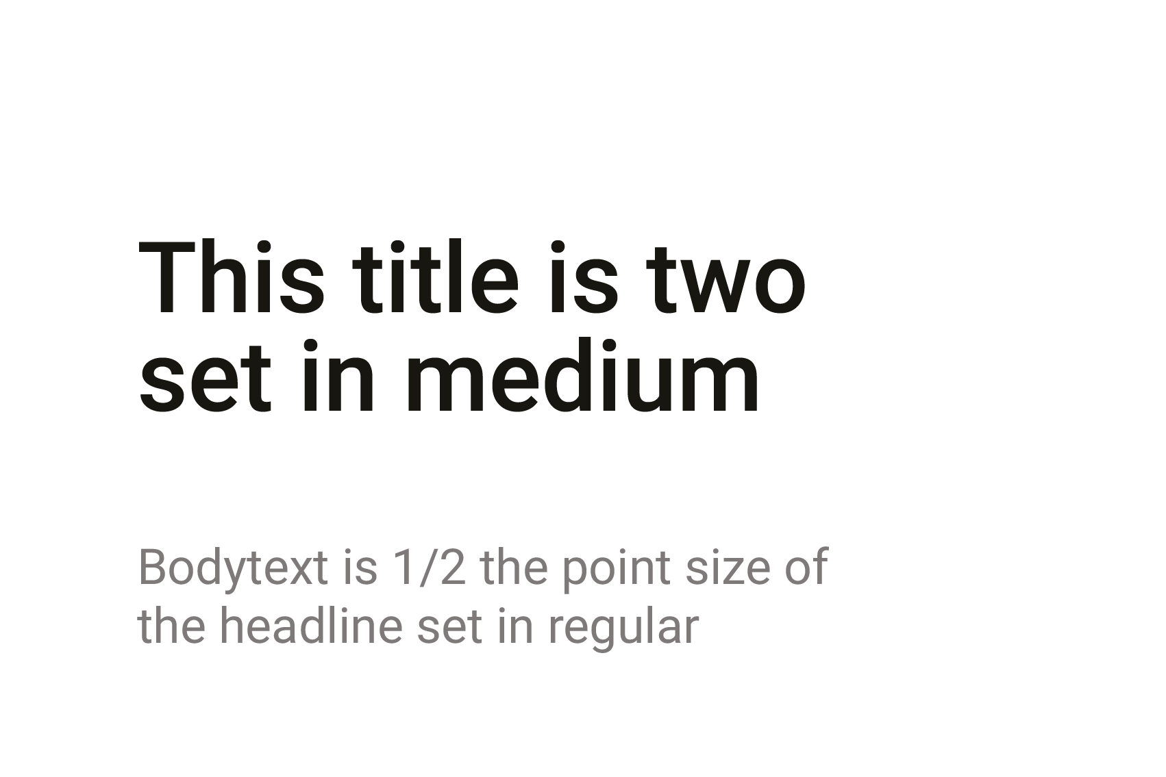
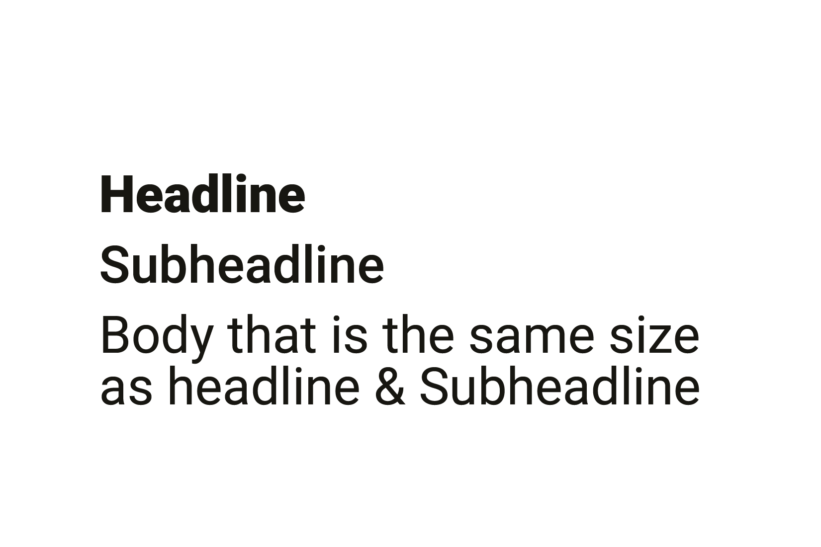
Font Pairings
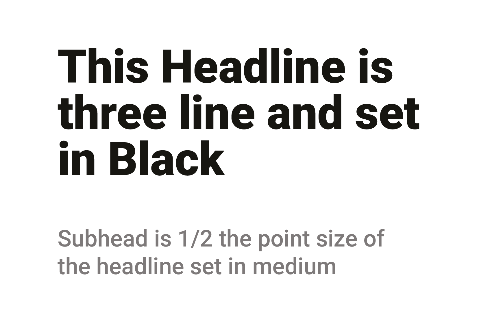
Example
Avoid

Avoid using all caps when it’s not needed.
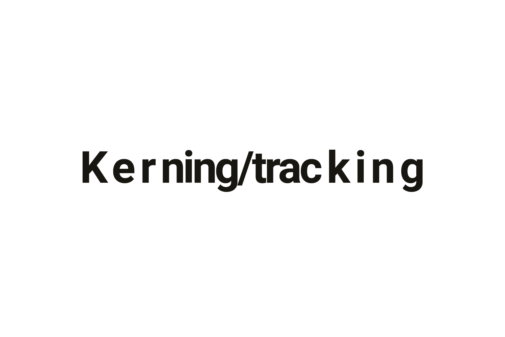
Carefully to adjust kerning or tracking.
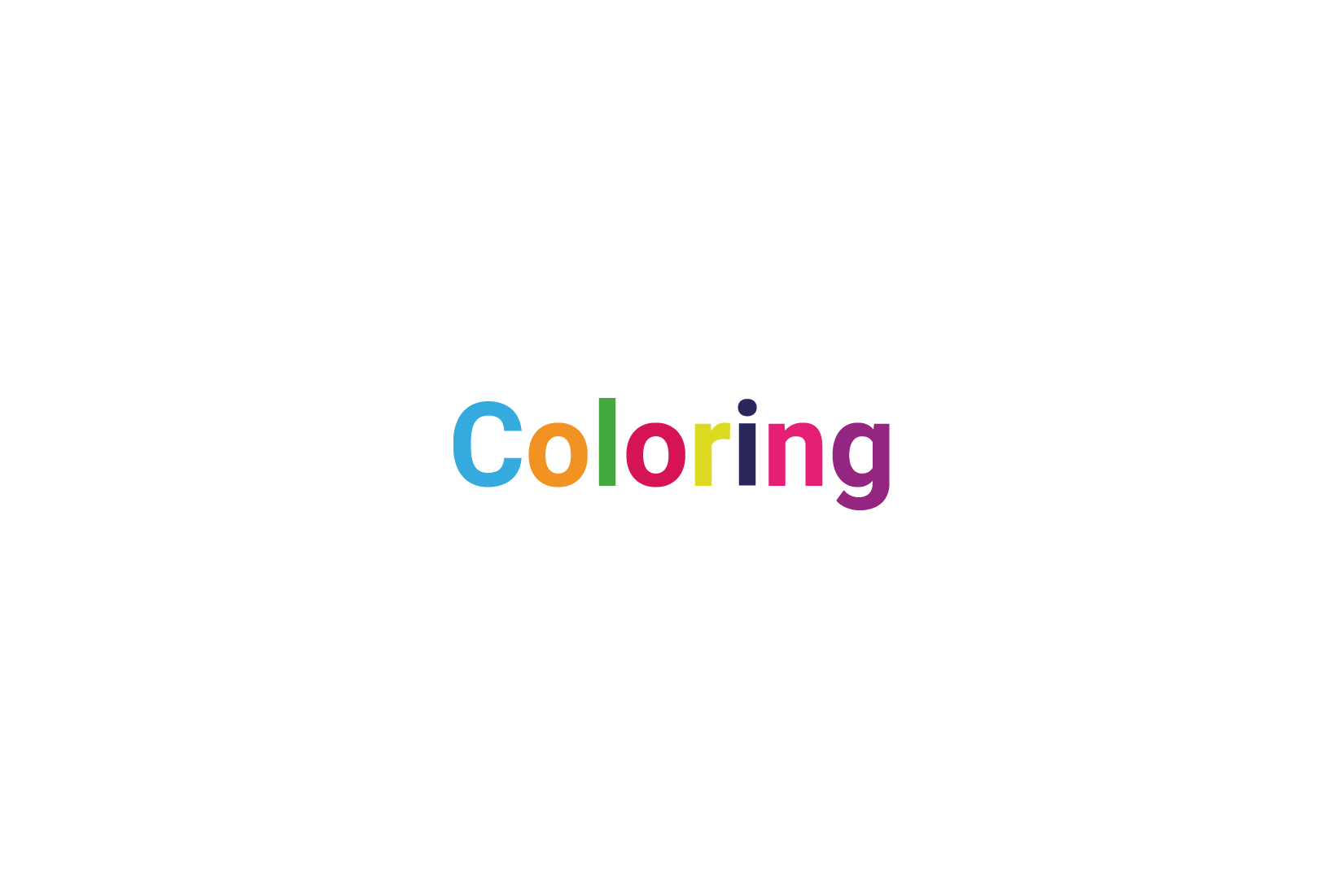
Avoid colored fonts for better readability.
Don’t use the same font weight, for legibility.
Don’t use the same font size, for legibility.